Stephen Synakowski Architect PLLC
Retrofit + Renovation of Urban Buildings;
CRE Commercial Lending Crisis Responsive Building + Site Design
ReDesign / RePlanning of Large MultiFamily, Educational, Industrial Buildings;
Master Site Design + Site Planning for Large Revised Architectural Programs
RESIDENTIAL + COMMERCIAL + EDUCATIONAL ARCHITECTURAL PRODUCTS _ DESIGN SERVICES FOR THE CURRENT ECONOMY
GENERAL PROFESSIONAL AIM
This website includes illustrations of a variety of building renovation and repurposing strategies, for consideration by private developers in response to the Commercial Real Estate Crisis.
Designs are large scale and include reconfiguation of large floor plans for new programs and vertical building additions, both spanning with steel frame and superimposed massonry.
Invested energy and invested capital are going to the chiefy metrics in this strategy, the chief measure being
Project Scope, the budget for the proposed work in relation to the cost savings by employing existing context which is kept.
Representing alignment of design, fabrication and site assembly these ideas for products and services reflect near term Best Practices based strategies to economically deliver enclosure at urban scale, in an era when tools for design and delivery of buildings are fundamentally changing and make such an approach possible.
MultiFamily Repurposing
Adaptive Reuse Urban Condos
Lowrise + Midrise
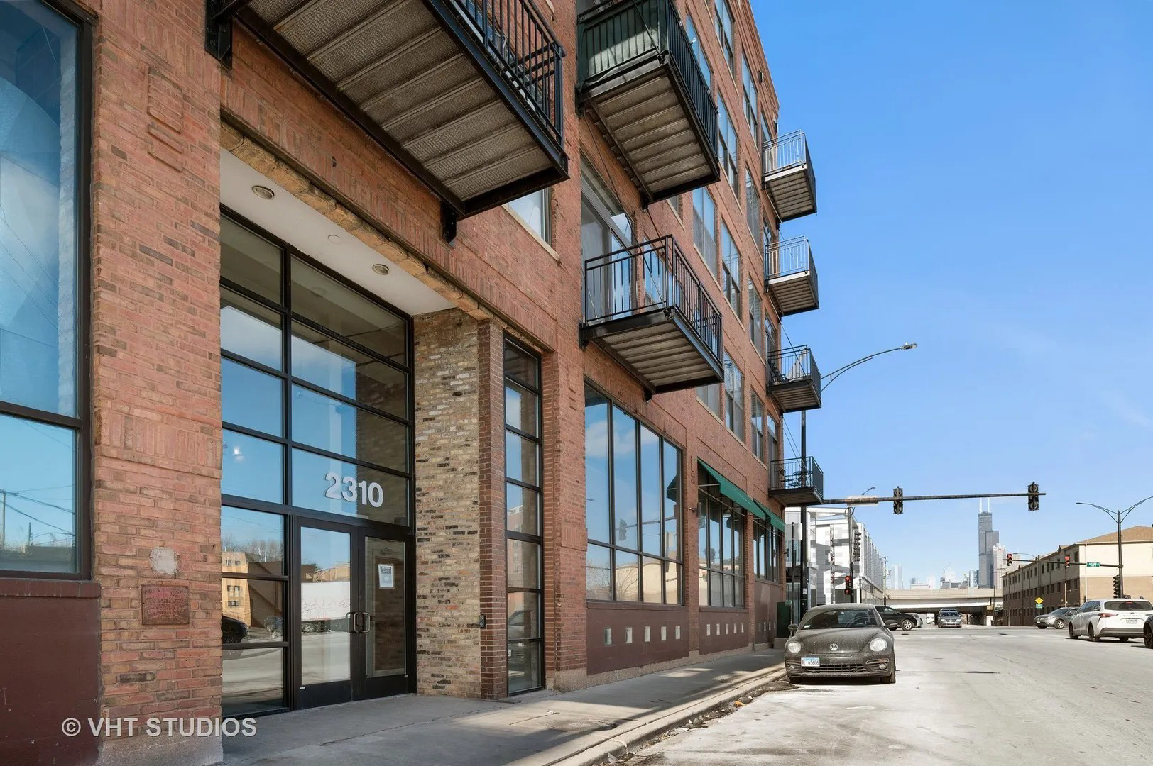
MultiFamily
This is a description of the project. This text is optional and the site layout works fine without it. The slider above (included in the Pro version only) is swipe-enabled with hardware accelerated transitions so it works super-smoothly on touch devices like the iPhone and iPad.
- Client: Wernham Hogg
- Role: Art Direction, Photography, Illustration
- Year: 2013
Large Traditional Buildings
Program Packing
New Design Programs within Original Masonry Perimeters
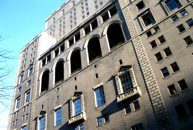
Institutional
This is a description of the project. This text is optional and the site layout works fine without it. The slider above (included in the Pro version only) is swipe-enabled with hardware accelerated transitions so it works super-smoothly on touch devices like the iPhone and iPad.
- Client: Wernham Hogg
- Role: Art Direction, Photography, Illustration
- Year: 2013
Educational Repurposing
Collegiate Assembly + Learning
New Assembly_Athletic Design Programs within Historic Buildings
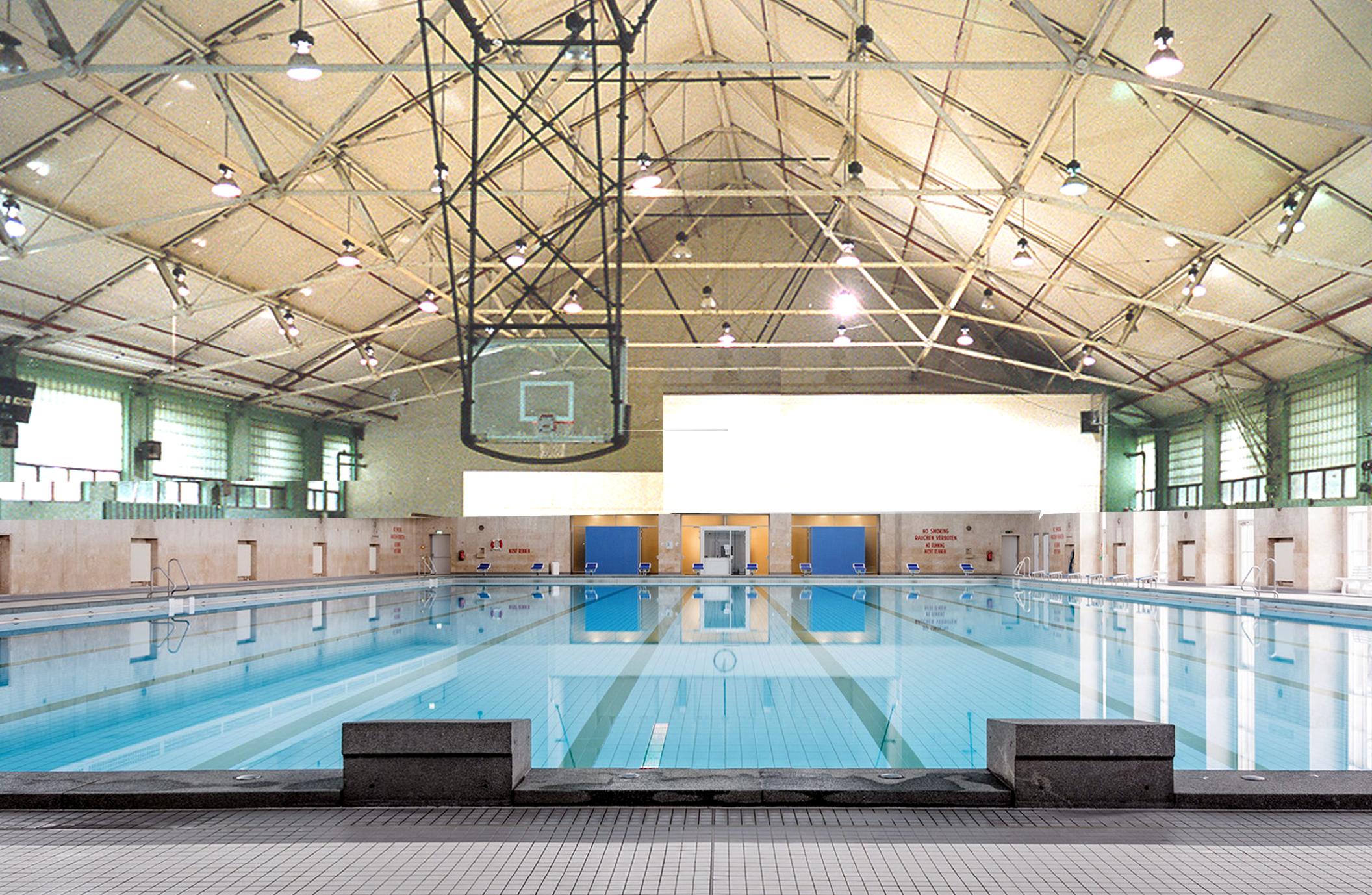
Educational
This is a description of the project. This text is optional and the site layout works fine without it. The slider above (included in the Pro version only) is swipe-enabled with hardware accelerated transitions so it works super-smoothly on touch devices like the iPhone and iPad.
- Client: Wernham Hogg
- Role: Art Direction, Photography, Illustration
- Year: 2013
Lowrise Repurposing
Arts Center Program Insertion
Program Management_Historic Architectures

Arts Center
This is a description of the project. This text is optional and the site layout works fine without it. The slider above (included in the Pro version only) is swipe-enabled with hardware accelerated transitions so it works super-smoothly on touch devices like the iPhone and iPad.
- Client: Wernham Hogg
- Role: Art Direction, Photography, Illustration
- Year: 2013
Vertical Building Additions
Building Over Building
Trussed Wide Spans
Superimposed Masonry Additions
SuperImposed Architectures
This is a description of the project. This text is optional and the site layout works fine without it. The slider above (included in the Pro version only) is swipe-enabled with hardware accelerated transitions so it works super-smoothly on touch devices like the iPhone and iPad.
- Client: Wernham Hogg
- Role: Art Direction, Photography, Illustration
- Year: 2013
Large Scale Land Use Planning
Brownfield
Attached + Detached Communities
Former Campuses

Large Scale Site Design
This is a description of the project. This text is optional and the site layout works fine without it. The slider above (included in the Pro version only) is swipe-enabled with hardware accelerated transitions so it works super-smoothly on touch devices like the iPhone and iPad.
- Client: Wernham Hogg
- Role: Art Direction, Photography, Illustration
- Year: 2013
About page header
Type & Grids is a HTML5 template that focuses on typography and grids. It's responsive which means it looks great on all devices from desktops to laptops to tablets and mobile phones. It's super-customizable and comes with lots of nicely designed type and color themes. Download the free zip file to get started!
Subheader lorem ipsum
10% of every sale is donated to the National Audubon Society. Audubon's mission: To conserve and restore natural ecosystems, focusing on birds, other wildlife, and their habitats for the benefit of humanity and the earth's biological diversity.
Subheader lorem ipsum
Type & Grids comes with 19 different type theme CSS files and 28 different color theme CSS files. You can easily mix and match the type and color themes to create a unique design for your site. No CSS knowledge is needed and all of the fonts shown in the demo are included. 58 different background textures come with the download as well.
- Simple to set up and update – all of the content is inside a single "index.html" page
- Contains 19 type themes and 28 color themes which gives you over 500 unique design combinations – 58 background textures are included as well
- Each type theme is meticulously handcrafted to ensure attention is paid to the small typographic details
- Fully responsive design – looks great on all devices from desktops to laptops to tablets and mobile phones
- Swipe-enabled with hardware accelerated transitions – works super-smoothly on touch devices like the iPhone and iPad
- Coded using the latest HTML5/CSS3 standards and all code is W3C valid and cross-browser compatible
- Video support – easily embed your videos from Vimeo or YouTube
- Clean and semantic SEO-friendly code
- Design featured on the FWA Public Shortlist, Creattica and numerous other design sites
- Support and documentation is available but everything is so simple to set up you probably won't need it
Subheader lorem ipsum
Lorem ipsum dolor sit amet, consectetur adipiscing elit. Donec ac ante arcu, quis auctor sapien. Morbi magna leo, dapibus a pulvinar et, pharetra scelerisque felis. Mauris massa magna, gravida vitae convallis sagittis, sagittis ac ipsum. Integer arcu justo, vehicula vel accumsan ac, venenatis in massa. Curabitur in dui in urna interdum ullamcorper. Pellentesque ut imperdiet libero.
“Lorem ipsum dolor sit amet, consectetur adipiscing elit. Donec ac ante arcu, quis auctor sapien. Morbi magna leo, dapibus a pulvinar et, pharetra scelerisque felis. Mauris massa magna, gravida vitae convallis sagittis, sagittis ac ipsum. Integer arcu justo, vehicula vel accumsan ac, venenatis in massa. Curabitur in dui in urna interdum ullamcorper. Pellentesque ut imperdiet libero.”
John Doe, Google
Subheader lorem ipsum
Lorem ipsum dolor sit amet, consectetur adipiscing elit. Donec ac ante arcu, quis auctor sapien. Morbi magna leo, dapibus a pulvinar et, pharetra scelerisque felis. Mauris massa magna, gravida vitae convallis sagittis, sagittis ac ipsum. Integer arcu justo, vehicula vel accumsan ac, venenatis in massa. Curabitur in dui in urna interdum ullamcorper. Pellentesque ut imperdiet libero.

- Location: Stockholm, Sweden
- Email: hello@ivandesignostrom.com
- Résumé: resume.pdf
- LinkedIn: www.linkedin.com/in/ivandesignostrom
Retrofit + Renovation of Urban Buildings;
CRE Commercial Lending Crisis Responsive Building + Site Design
Master Site Design + Site Planning for Large Revised Architectural Programs
RESIDENTIAL + COMMERCIAL + EDUCATIONAL ARCHITECTURAL PRODUCTS _ DESIGN SERVICES FOR THE CURRENT ECONOMY
This website includes illustrations of a variety of building renovation and repurposing strategies, for consideration by private developers in response to the Commercial Real Estate Crisis.
Designs are large scale and include reconfiguation of large floor plans for new programs and vertical building additions, both spanning with steel frame and superimposed massonry.
Invested energy and invested capital are going to the chiefy metrics in this strategy, the chief measure being
Project Scope, the budget for the proposed work in relation to the cost savings by employing existing context which is kept.
Representing alignment of design, fabrication and site assembly these ideas for products and services reflect near term Best Practices based strategies to economically deliver enclosure at urban scale, in an era when tools for design and delivery of buildings are fundamentally changing and make such an approach possible.
MultiFamily Repurposing
Adaptive Reuse Urban Condos
Lowrise + Midrise
MultiFamily
This is a description of the project. This text is optional and the site layout works fine without it. The slider above (included in the Pro version only) is swipe-enabled with hardware accelerated transitions so it works super-smoothly on touch devices like the iPhone and iPad.
- Client: Wernham Hogg
- Role: Art Direction, Photography, Illustration
- Year: 2013
Large Traditional Buildings
Program Packing
New Design Programs within Original Masonry Perimeters
Institutional
This is a description of the project. This text is optional and the site layout works fine without it. The slider above (included in the Pro version only) is swipe-enabled with hardware accelerated transitions so it works super-smoothly on touch devices like the iPhone and iPad.
- Client: Wernham Hogg
- Role: Art Direction, Photography, Illustration
- Year: 2013
Educational Repurposing
Collegiate Assembly + Learning
New Assembly_Athletic Design Programs within Historic Buildings
Educational
This is a description of the project. This text is optional and the site layout works fine without it. The slider above (included in the Pro version only) is swipe-enabled with hardware accelerated transitions so it works super-smoothly on touch devices like the iPhone and iPad.
- Client: Wernham Hogg
- Role: Art Direction, Photography, Illustration
- Year: 2013
Lowrise Repurposing
Arts Center Program Insertion
Program Management_Historic Architectures
Arts Center
This is a description of the project. This text is optional and the site layout works fine without it. The slider above (included in the Pro version only) is swipe-enabled with hardware accelerated transitions so it works super-smoothly on touch devices like the iPhone and iPad.
- Client: Wernham Hogg
- Role: Art Direction, Photography, Illustration
- Year: 2013
Vertical Building Additions
Building Over Building
Trussed Wide Spans
Superimposed Masonry Additions
SuperImposed Architectures
This is a description of the project. This text is optional and the site layout works fine without it. The slider above (included in the Pro version only) is swipe-enabled with hardware accelerated transitions so it works super-smoothly on touch devices like the iPhone and iPad.
- Client: Wernham Hogg
- Role: Art Direction, Photography, Illustration
- Year: 2013
Large Scale Land Use Planning
Brownfield
Attached + Detached Communities
Former Campuses
Large Scale Site Design
This is a description of the project. This text is optional and the site layout works fine without it. The slider above (included in the Pro version only) is swipe-enabled with hardware accelerated transitions so it works super-smoothly on touch devices like the iPhone and iPad.
- Client: Wernham Hogg
- Role: Art Direction, Photography, Illustration
- Year: 2013
About page header
Type & Grids is a HTML5 template that focuses on typography and grids. It's responsive which means it looks great on all devices from desktops to laptops to tablets and mobile phones. It's super-customizable and comes with lots of nicely designed type and color themes. Download the free zip file to get started!
Subheader lorem ipsum
10% of every sale is donated to the National Audubon Society. Audubon's mission: To conserve and restore natural ecosystems, focusing on birds, other wildlife, and their habitats for the benefit of humanity and the earth's biological diversity.
Subheader lorem ipsum
Type & Grids comes with 19 different type theme CSS files and 28 different color theme CSS files. You can easily mix and match the type and color themes to create a unique design for your site. No CSS knowledge is needed and all of the fonts shown in the demo are included. 58 different background textures come with the download as well.
- Simple to set up and update – all of the content is inside a single "index.html" page
- Contains 19 type themes and 28 color themes which gives you over 500 unique design combinations – 58 background textures are included as well
- Each type theme is meticulously handcrafted to ensure attention is paid to the small typographic details
- Fully responsive design – looks great on all devices from desktops to laptops to tablets and mobile phones
- Swipe-enabled with hardware accelerated transitions – works super-smoothly on touch devices like the iPhone and iPad
- Coded using the latest HTML5/CSS3 standards and all code is W3C valid and cross-browser compatible
- Video support – easily embed your videos from Vimeo or YouTube
- Clean and semantic SEO-friendly code
- Design featured on the FWA Public Shortlist, Creattica and numerous other design sites
- Support and documentation is available but everything is so simple to set up you probably won't need it
Subheader lorem ipsum
Lorem ipsum dolor sit amet, consectetur adipiscing elit. Donec ac ante arcu, quis auctor sapien. Morbi magna leo, dapibus a pulvinar et, pharetra scelerisque felis. Mauris massa magna, gravida vitae convallis sagittis, sagittis ac ipsum. Integer arcu justo, vehicula vel accumsan ac, venenatis in massa. Curabitur in dui in urna interdum ullamcorper. Pellentesque ut imperdiet libero.
“Lorem ipsum dolor sit amet, consectetur adipiscing elit. Donec ac ante arcu, quis auctor sapien. Morbi magna leo, dapibus a pulvinar et, pharetra scelerisque felis. Mauris massa magna, gravida vitae convallis sagittis, sagittis ac ipsum. Integer arcu justo, vehicula vel accumsan ac, venenatis in massa. Curabitur in dui in urna interdum ullamcorper. Pellentesque ut imperdiet libero.” John Doe, Google
Subheader lorem ipsum
Lorem ipsum dolor sit amet, consectetur adipiscing elit. Donec ac ante arcu, quis auctor sapien. Morbi magna leo, dapibus a pulvinar et, pharetra scelerisque felis. Mauris massa magna, gravida vitae convallis sagittis, sagittis ac ipsum. Integer arcu justo, vehicula vel accumsan ac, venenatis in massa. Curabitur in dui in urna interdum ullamcorper. Pellentesque ut imperdiet libero.
- Location: Stockholm, Sweden
- Email: hello@ivandesignostrom.com
- Résumé: resume.pdf
- LinkedIn: www.linkedin.com/in/ivandesignostrom